CONCEPT & EXECUTION
The LivingSocial homepage needs a redesign in order to gain new customers and drive revenue.
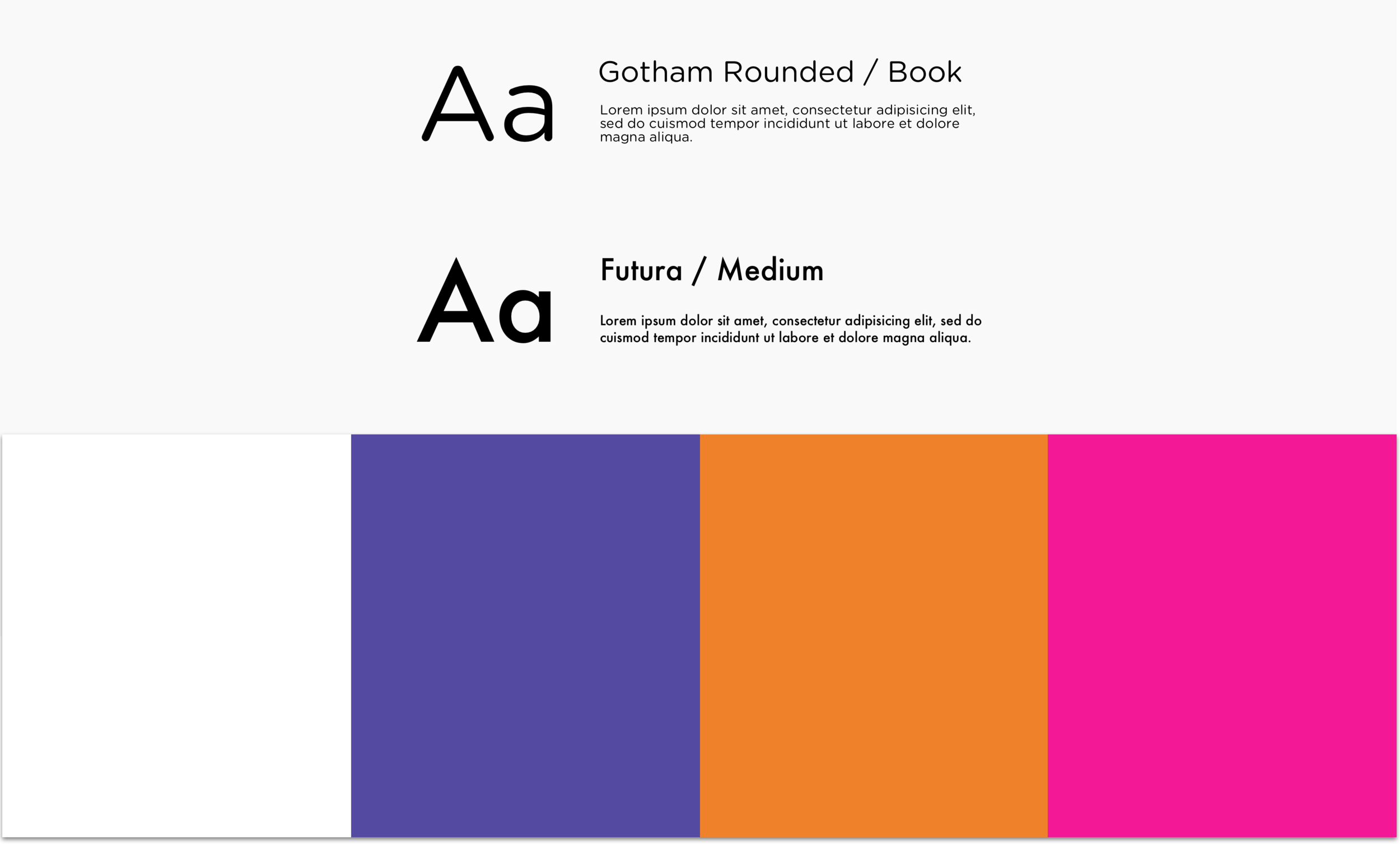
In order to do this, I wanted to capture the feel and sensibility of the existing brand, but modernize it with more attention to white space and a limited color palette.
USER TYPES
NON SIGNED-IN USER HOMEPAGE
The non-signed in user homepage design draws in new users with a CTA to enter an email address to receive updates and extra discounts. It also features a small yet functional educational section that explains to users what our site offers, accompanied by sleek icons.
SIGNED IN USER HOMEPAGE
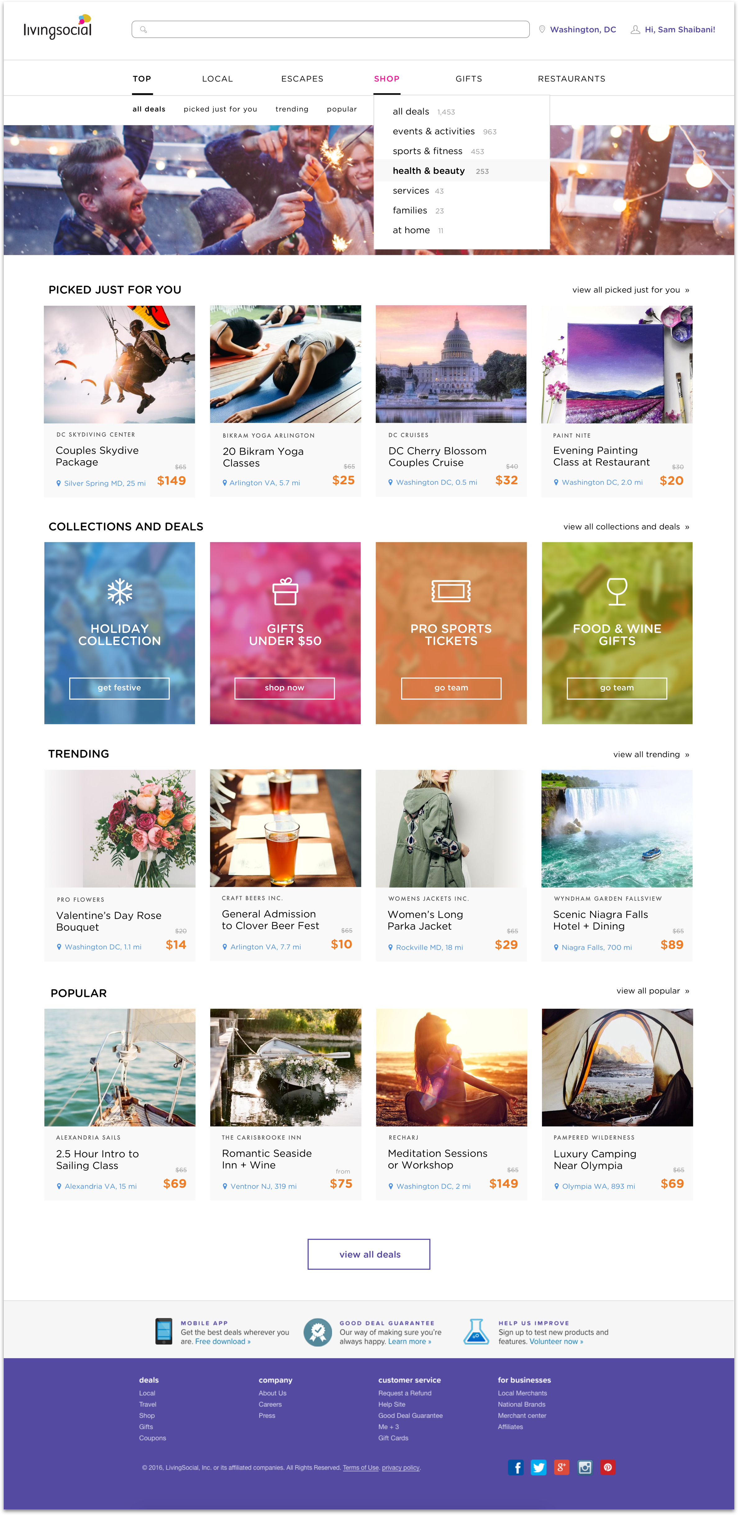
The signed-in homepage design features the navigation above the lifestyle image to allow users to navigate quickly and easily. As you scroll down, the deals are tailored to the users’ preferences based on previous buying history and location.


